Create Your First Project
Start adding your projects to your portfolio. Click on "Manage Projects" to get started
Branding: OpScope
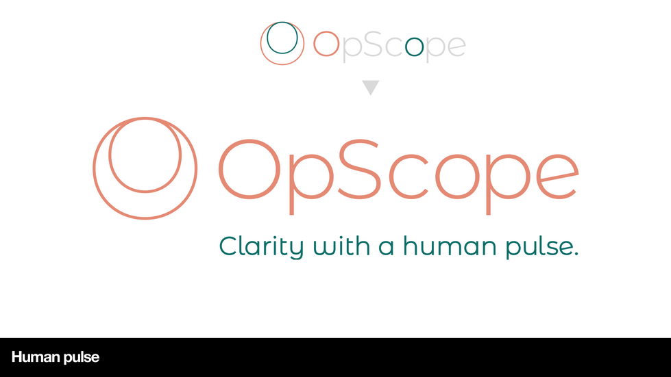
For OpScope’s rebrand, I developed two distinct creative directions that explored how the company could visually express its mission of delivering clear, confident operational intelligence. Infinite Clarity focused on precision, structure and always-on insight, using geometric forms and a confident colour system to communicate dependable, continuous intelligence built from every moment of operational activity. Human Pulse introduced a more empathetic, people-first perspective, using warm tones, rounded forms and human-led imagery to reflect OpScope’s belief that meaningful insight starts with the lived experience of teams. Together, these directions offered the client two strategically grounded pathways one engineered for analytical clarity, the other built around trust and human understanding, demonstrating a comprehensive brand exploration that balanced precision with empathy.


